Before making the magazine front cover, I thought that it would be wise to research some film magazines and take time to look at the mis-en-scene, the position of the text on the cover, typography and other key elements. I first looked at a popular horror film magazine called Fangoria, which is probably americas biggest horror film magazine. I noticed that the front covers of this magazine were extremely gory and bloody and I felt that it was very 'in your face' which is constant throughout their front covers on each issue.
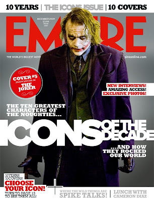
 I went on to look at EMPIRE magazine, a much broader minded film magazine which promotes a wider range of film genres and provides the reader with extensive film reviews, news and interviews. I found that the layout of the front cover was similar in ways to that of Fangoria, however, i thought that the style they used was different from the typography to the framing and lighting. I felt that empires lighting was a lot more artificial and there was a lot more attention to detail for the models on the cover.
0 comments:
Post a Comment