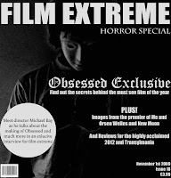
After researching different existing magazines and looking at their front covers I decided to start making one for the groups film. I looked at all the pictures I had taken and chose one to use for the front cover of our magazine.
Firstly, I altered my images using some of the adjustments on Photoshop CS3. these adjustments included using black & white, shadow/highlight and curves in an attempt to create different effects like mystery, fear and horror.
When using the adjustments, my main aim was to have a dark side and bright side to the image, resulting in only half of the mask being visible. The other reason I wanted to effectively blackout one side is because it will provide a nice surface to write key magazine information on.

After this, I attempted to replicate what I had observed in my magazine research of EMPIRE magazine by placing the title of our magazine, Film Extreme, at the top of the image in an impact font. I used an impact font because I felt that it stands out and is clear to read.
0 comments:
Post a Comment