When it comes to the music for trailer, one of the group member used garage band to make a soundtrack. This soundtrack didn't quite flow and give the right atmosphere that we wanted for the trailer. We found that the music didn't reflect the genre that we were trying to promote.
Therefore we looked for non-copyright music on freeplaymusic.com which provided us with the soundtrack that we felt gave us the correct feeling and promoted the genre. Firstly we chose a horror instrumental which we thought was ok but we felt that it made the protagonist in the film seem angelic when we actually wanted the music to show that he is psychopathic and obsessed. After having another look for a different soundtrack we ended up going with a Hard Rock instrumental which gave us the earing feeling we want along with giving the trailer an edge.
Saturday, 28 November 2009
Music - Soundtrack for Trailer
Monday, 23 November 2009


Magazine Front Cover Comparison


Stages of the Magazine Front Cover


Image with black & white adjustment and shadow/highlight adjustment

Image with black and white, shadow/highlight and curves adjustments

Making The Magazine Front Cover

After researching different existing magazines and looking at their front covers I decided to start making one for the groups film. I looked at all the pictures I had taken and chose one to use for the front cover of our magazine.
Firstly, I altered my images using some of the adjustments on Photoshop CS3. these adjustments included using black & white, shadow/highlight and curves in an attempt to create different effects like mystery, fear and horror.
When using the adjustments, my main aim was to have a dark side and bright side to the image, resulting in only half of the mask being visible. The other reason I wanted to effectively blackout one side is because it will provide a nice surface to write key magazine information on.

After this, I attempted to replicate what I had observed in my magazine research of EMPIRE magazine by placing the title of our magazine, Film Extreme, at the top of the image in an impact font. I used an impact font because I felt that it stands out and is clear to read.
Friday, 20 November 2009
Profile of Protagonist
 Personal Profile: Peter grew up in a small town called Highland grove. He was one of many as he has 6 other brothers and sisters. His mother didn’t know she was pregnant with him until it was too late to get rid of him, so he was a mistake, according to his mother. So whilst she was pregnant with him she drank and smoked everyday without fail. As a result of that Peter was born with a mental illness called sadistissonia – meaning that he had no control over his mental and physical reactions to anger and sadness. The doctors told his mother that it could trigger off at any stage of his life. Due to his illness he didn’t get the attention and love from his mother like the rest of his brothers and sisters. Instead he was isolated and withdrawn from his nuclear family as well as society. There was only one thing that made Peter happy and that was a gym skipping rope. He treasured that skipping rope because it was the first thing his first crush ever brought for him when he was 15, right before she died. She was murdered by a famous serial killer who kidnapped her. She was the only one that Peter ever cared about. Since the incident, Peter developed an obsession towards famous serial killers; he searched most of the brutal killings online, most of them happened to be local. He began to take pleasure in the stories as he read them online, he somehow found comfort in knowing the reasons why they killed innocents. He then became envious of all the killers appearing on the news and headlines. Not realising that the incident had triggered his illness, he read the latest story of a boy killing the whole of his class year just to become famous, using a bow and arrow from the story robin hood. He then began to think about what weapon he could use to do these killings that was easy to get hold of in high school. He then remembered the rope that was given to him by his crush, and decided that that was the best weapon to use to kill students in his year. After his first killing Peter then became obsessed with the adrenaline he felt when committing these killings, on his last victim, he made sure that he fell asleep next to her, in order to get caught in the act. When he was asked ‘why did he commit all these murders?’ He declared “I was giving them the excitement and scandal they secretly craved”
Thursday, 19 November 2009
Magazine Research

Before making the magazine front cover, I thought that it would be wise to research some film magazines and take time to look at the mis-en-scene, the position of the text on the cover, typography and other key elements. I first looked at a popular horror film magazine called Fangoria, which is probably americas biggest horror film magazine. I noticed that the front covers of this magazine were extremely gory and bloody and I felt that it was very 'in your face' which is constant throughout their front covers on each issue.
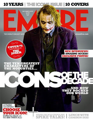 I went on to look at EMPIRE magazine, a much broader minded film magazine which promotes a wider range of film genres and provides the reader with extensive film reviews, news and interviews. I found that the layout of the front cover was similar in ways to that of Fangoria, however, i thought that the style they used was different from the typography to the framing and lighting. I felt that empires lighting was a lot more artificial and there was a lot more attention to detail for the models on the cover.